Differences between branding, brand and visual identity

Even if on many occasions branding, brand and visual identity are usually considered the same, in reality, this is far from the truth. But what’s true is that even if you want a solid business, you need to grow your branding, your brand and get strong and consistent identity, the design of your logo isn’t enough.
To understand the differences between branding, brand and visual identity, and to build a great brand, there are three key terms that you have to learn to understand their differences:
- Brand: how people perceive your company.
- Branding: the actions you take to create a specific image for your company.
- Brand identity: the set of tangible elements of your brand, that together, create the brand’s image.
Before getting to know these branding, brand and visual identity concepts, you need to learn exactly the purpose of each one.
¿What’s branding?
Branding is a set of “intangible” goods, service or product of a company. It’s a definition of an “emotional relationship” between the clients and business.
Branding could be defined as an experience. The core of branding consists of a mission, values, vision and the company’s voice. So we could say, it’s the experience the client has with the brand. It is the way we share our brand with the audience. What everyone remembers when thinking about your business. In some way, it’s the psychological relationship between your company and the client.
Branding is the personality, the style of your business, it is what the client sees and feels when using your product. It’s what gives shape to your business and what makes it different from your competition, among other things.
This way, a strategy that could be used to create the branding is the how, what, where, when and with who you want to share and show the messages and values of your brand.
Mentioned in a quote by Walter Landor “The products are made in the factory, but the brands are made in the mind”
People “Fell in love” with brands, they trust them and believe in their superiority. A clear example is Apple. There are many fans who buy and will keep buying their products, even if they aren’t the best or even the cheapest ones in the market.
¿What’s brand identity/brand design?

The brand identity / brand design is what you can see and feel from a company. After seeing their pictures (some call it the visual identity). This includes colors, fonts, logos, alternative logos, graphic elements, photographs. The brand goes in hand with brand identity, and sometimes, is hard to distinguish between the two.
It’s going to be easier to explain it with an example. Dior projects an image of an exclusive and elegant brand. And its style follows accordingly. That’s why, they have a very simple website, with their iconic logo and also, they use colors such as black, white and some neutral colors. They also hire famous people to include on their ads, like Johnny Depp or Charlize Theron. It is the perfect combination of branding, brand, brand identity and brand design. And this helps create a special experience with the user, and in the end, this is branding’s final objective.
What’s clear is that branding, brand and visual identity should go hand in hand. This way you’ll be able to recognize the brand even without seeing their logo.
The identity of a brand consists of the following elements:
- Logo.
- Key colors (color pallet).
- Types of corporate letters.
- Standard typographic treatments.
- Consistent style for the images.
- A library of graphic elements.
Differences between branding and visual identity
- Branding is intangible. Is what people see or have in mind when they think of your business. As mentioned before, branding is an experience. Is what people associate with your brand. The first thing that comes in mind.
- The brand identity is tangible, it’s like the brand’s face. This is the visual representation of a business. The brand identity is what you can see. This promotes the recognition of a brand, it what makes it different from the rest.
All the visual aspects of a brand can be seen as brand identity. Some other people call it a corporate identity.
What’s true is that the number of elements of the identity system of a brand completely depends on how many points of contact or applications must be designed for a brand
How does branding and brand identity work together?
When you define the missions, values, objectives, the target audience or the keywords of a brand, you are creating the foundation of branding. The brand identity is the visible face of the same brand. That’s why you must be sure that the face of your brand represents everything in a very distinctive, memorable and professional way.
Brand identity is the set of characteristics that define the values and mission of your business. The company logos, product design, and ethics of your business. All are part of your brand.
The objective of using all these visual and physical elements is to create a positive impression on your clients. The brand’s identity also:
- Provides a unique feel to your products.
- Show your clients who you are and how you solve problems.
- Conveys the things you want your clients to feel when using your products.
What’s a logo?

The logo is a visual representation of branding. It’s the graphic symbol of your brand. To stand out from the rest, it’s important to invest time and money for your design. In the end, this is your graphic identity. By doing this, you’ll get a professional visual presence. And it will give coherence to all the other platforms of your business when it comes to visual look.
The objective of creating a good logo is that you must identify the business in a way that is recognizable and memorable in the minds of its users.
The IKEA logo, as you can see in the image above, has changed a lot with the times, but it remained constant since 1967. Only changing its colors and keeping the shape and font. The combination of blue and yellow they use today, means trust and reliability. But also, friendliness and affordability. Together with the rounded and black font, and the oval frame, gives the impression of it being a strong, well-positioned and inclusive brand.
Examples of branding, brand and visual identity
These are some clear examples of how to use branding, brand and visual identity.
1.- Skype
![]()
Skype is a clear example of how branding, brand and visual identity come together. They have launched a new logo, a more stylized version that represents the look & feel of the Microsoft Logo. This design forms part of a great transformation phase because the company has also changed the design of its website and mobile app.
The website’s new design tries to offer more flexibility, allowing its users to personalize the platform with many different colors or by adding emojis to the conversations.
2.- Spotify

Spotify’s style guide might look basic and green, but the brand is more than just its lime green circle logo. The pallet of colors of Spotify includes three color codes, while the rest of the guidelines of the company’s brand is focused mainly on the variation of the logo and cover. The style guide of the branding, brand and visual identity of Spotify lets you download an icon of its logo, so it’s easier to represent the brand without having to make it by hand.
3.- Jamie Oliver

Jamie Oliver has a fairly complete style guide for its branding, brand and visual identity that covers the location of the logo in all its kitchen products. The company also includes a wide pallet of colors with each color, ordered by the product in which it must appear.
4.- Herban Kitchen

Herban Kitchen has a unique pallet of colors and textures in its style guide. These guidelines help by not only showing how the logo will look, but also, how different the company’s outer facades will look for any potential client.
5.- Urban Outfitters

The picture, color and also voice tone appear in the brand guidelines, inspired in California by Urban Outfitters. But the company isn’t afraid to include information about their ideal consumer and the brand’s beliefs.
6.- Love to Ride
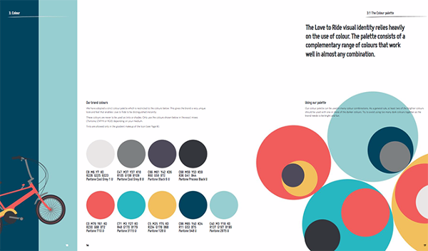
Love to Ride is a bicycle company, the variety of colors they use in their style guide is visually pleasing. The brand guidelines include nine color codes and tons of logo and background details.
7.- I Love New York

Despite their famous simple shirts, I Love New York also has a style guide for its brand. The company starts its guideline with a detailed explanation of its mission, vision, history, target audience and voice tone.
8.- University of the Arts Helsinki

The style guide of the University of the Arts Helsinki is more an art album than a traditional marketing guide. It shows you dozens of contexts available for the use of this school’s logo, including animation.
9.- Netflix

In regards to its public brand assets, Netflix mainly focuses on the treatment of its logo. The company offers a simple set of rules governing the size, spacing, and location of its famous uppercase typography. As well as a unique color code for its classic red logo.
If as a brand you need help improving the branding, brand and visual identity of your company, do not hesitate to get in touch with Antevenio. You’ll find what you were looking for. Wait no longer and get more info.